US Presidential State of the Union
Speech Visualization
Felix Gonda
felix.e.gonda@gmail.com/fgonda@fas.harvard.edu
Homework #3 Solution
Visualization (CS 171)Harvard University, Spring 2011
(Main Page) | (Run Applet)
Harvard
School of Engineering
& Applied Science
Instructor: Dr. Hanspeter Pfister Spring 2011
Part I: Acquire and manipulate text data
For my visualization, I decided to go with the recommendation given in the homework problem, which is to
do a comparison of all the US presidential state of the union speeches. I chose this dataset for several
reasons:
• The data is readily available on the web and can be found in a single location; therefore making it
easier to write a data scraping software to programmatically analyze the text and generates the
frequencies table.
• A presidential speech tends to have a specific theme and tone that is reflective of the state the
country. For example, during George W. Bush presidency, the tone of his speeches tends to center
around security while during Obama presidency his speeches centers on economy. So it’s interesting
to see the direction of the country based on the words use by the presidents over the years.
Data Source:
The source for all the speech texts is the American Presidency Project (http://www.presidency.ucsb.edu/sou.php)
which contains a database of all the state of the union addresses given by all US presidents from 1790 to 2011.
Data Acquisition and Code:
I acquired all my data programmatically using a python script that I wrote based on the homework 2 utilities.
I used BeautifulSoup to open links to all the speech documents and scrape and clean the data. Then the script
generates TSV file for each speech and stores it in the data directory of the visualization sketch software.
When the script is run, it outputs processing messages to the console to inform user what text is being process
at the time.
Part II: Visualization with processing
My processing visualization program can be found in the “WordVisualizer” directory of my homework 3 solution.
It contains the WordVisualizer file which is the main program to run.
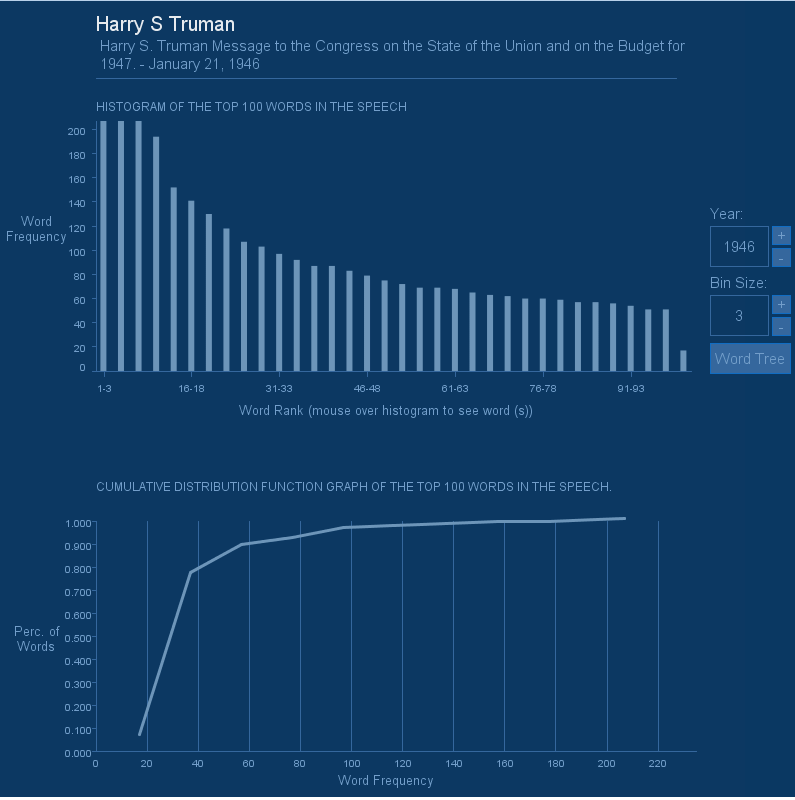
The visualization presents a histogram of the top 100 frequent words and a CDF graph. On the right hand side
is a set of navigation controls for browsing speeches by year and also for controlling the bin size of the
histogram (the range of the bin size is 1-10). The “Word Tree” button is used to view a tree version of the
visualization for extra credit. Placing the mouse over histogram bars will show the words represented by
each bar as tooltip popup.
Below is a screenshot of my visualization sketch in processing:
 References
Research Materials & References:
(1) Visual Thinking: for Design
Morgan Kaufmann; First Edition edition (April 18, 2008)
(2) Processing: A Programming Handbook for Visual Designers and Artists
The MIT Press (September 30, 2007)
(3) Ben Fry.
http://benfry.com/
(4) Processing Language
http://processing.org/
(5) American Presidency Project
http://www.presidency.ucsb.edu/sou.php
References
Research Materials & References:
(1) Visual Thinking: for Design
Morgan Kaufmann; First Edition edition (April 18, 2008)
(2) Processing: A Programming Handbook for Visual Designers and Artists
The MIT Press (September 30, 2007)
(3) Ben Fry.
http://benfry.com/
(4) Processing Language
http://processing.org/
(5) American Presidency Project
http://www.presidency.ucsb.edu/sou.php